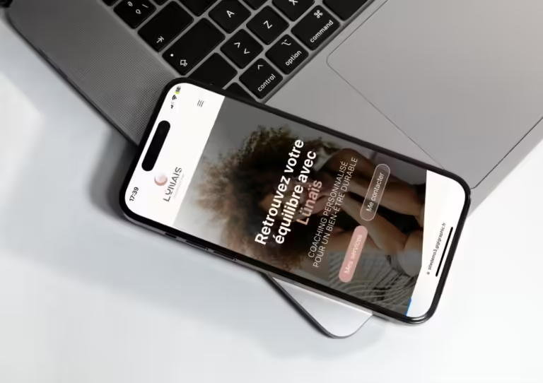
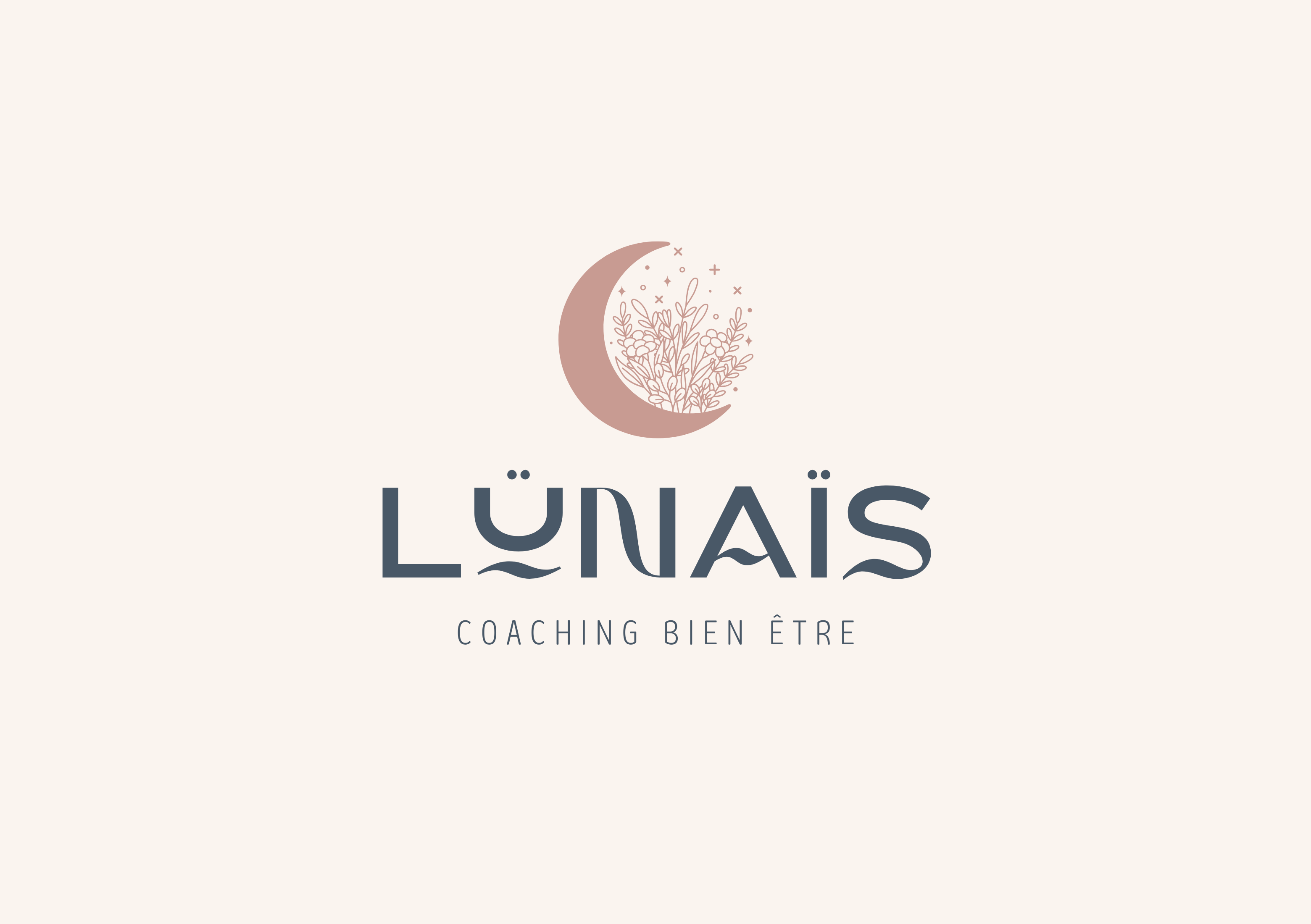
Comment j’ai rendu la charte graphique de Lünaïs Coaching percutante et mémorable ?
To give you an idea of my work, I've developed a brand identity coaching sur Canva for Lünaïs, a fictitious company dedicated to wellness coaching and personal fulfillment. The name evokes gentleness and harmony, essential values for guiding people towards a balanced life. Lünaïs embodies a benevolent and soothing approach, principles I wanted to translate into its visual identity.
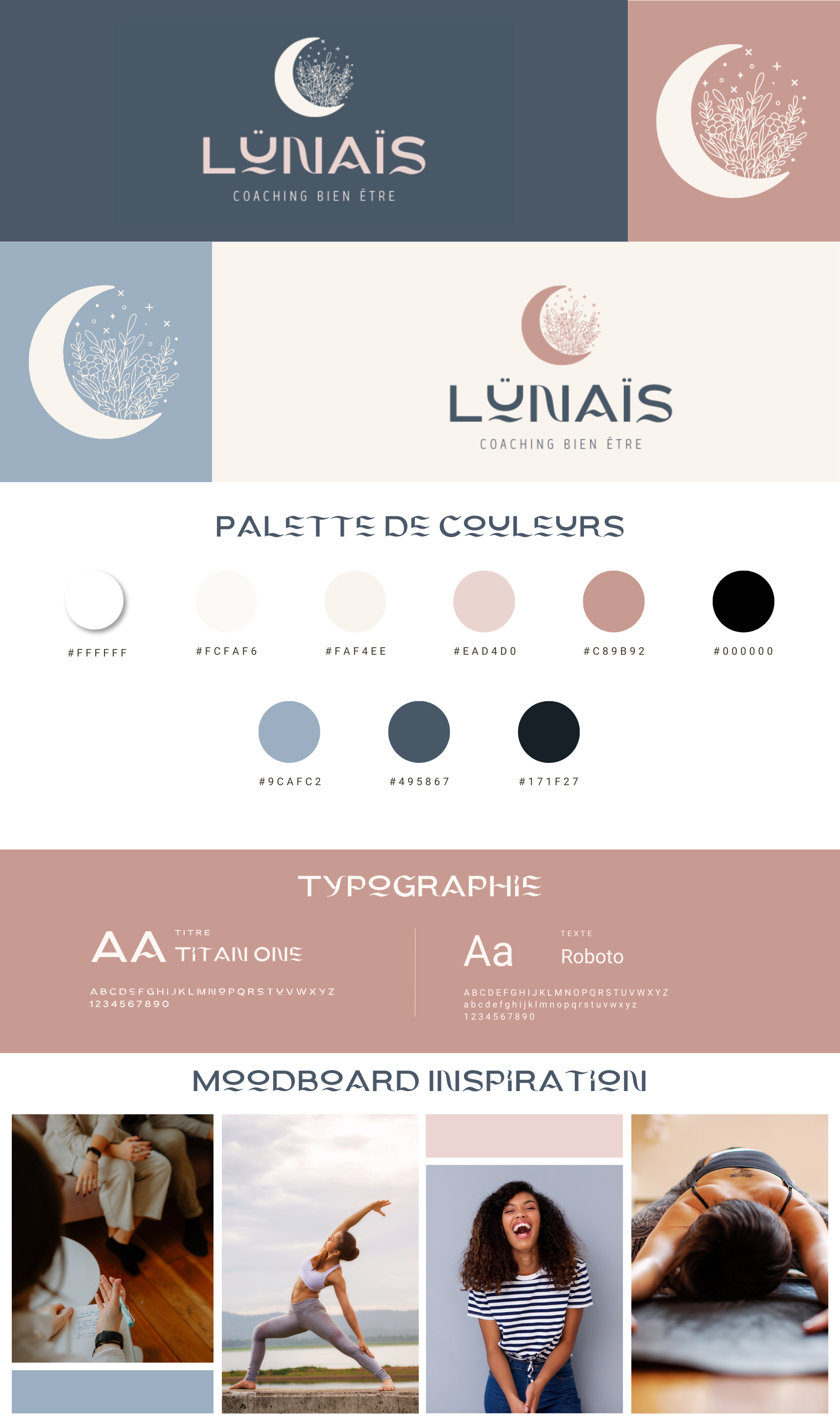
La typographie de cette charte graphique coaching
To reinforce this spirit of serenity and positivity, I chose a modern, elegant fontwith delicate curves. This choice reflects the notions of fluidity and transformation, essential in the journey towards well-being. The rounded shapes of the typography also recall harmony and balance, while infusing a welcoming touch of modernity.
La palette de cette charte graphique coaching
The color palette focuses on shades of blue and pink. Soft blue symbolizes inner peace, serenity and clarity of mind, offering a soothing, reassuring anchorage. Combined with this blue, soft pink embodies benevolence, self-love and positive energy. These colors complement each other to create a warm, inspiring atmosphere, inviting you on a journey towards well-being.
En complément, des touches de blanc ajoutent une sensation de pureté et de légèreté, tandis que des nuances pastel renforcent l’idée d’un univers apaisant et délicat. Cette combinaison de couleurs crée un équilibre harmonieux, évoquant à la fois douceur et vitalité, pour un résultat visuel qui résonne avec l’identité de Lünaïs.
L’ambiance de cette charte graphique coaching
Overall, this brand identity conveys a bright, positive atmosphere, conducive to relaxation and personal development. It reflects the values of welcome, transformation and harmony that are at the heart of the Lünaïs experience. Explore this visual universe to discover how these ideas could be realized in a unique and engaging online presence, perfectly aligned with your wellness coaching mission.