Comment j’ai rendu la charte graphique restaurant de Les Douze design et mémorable ?
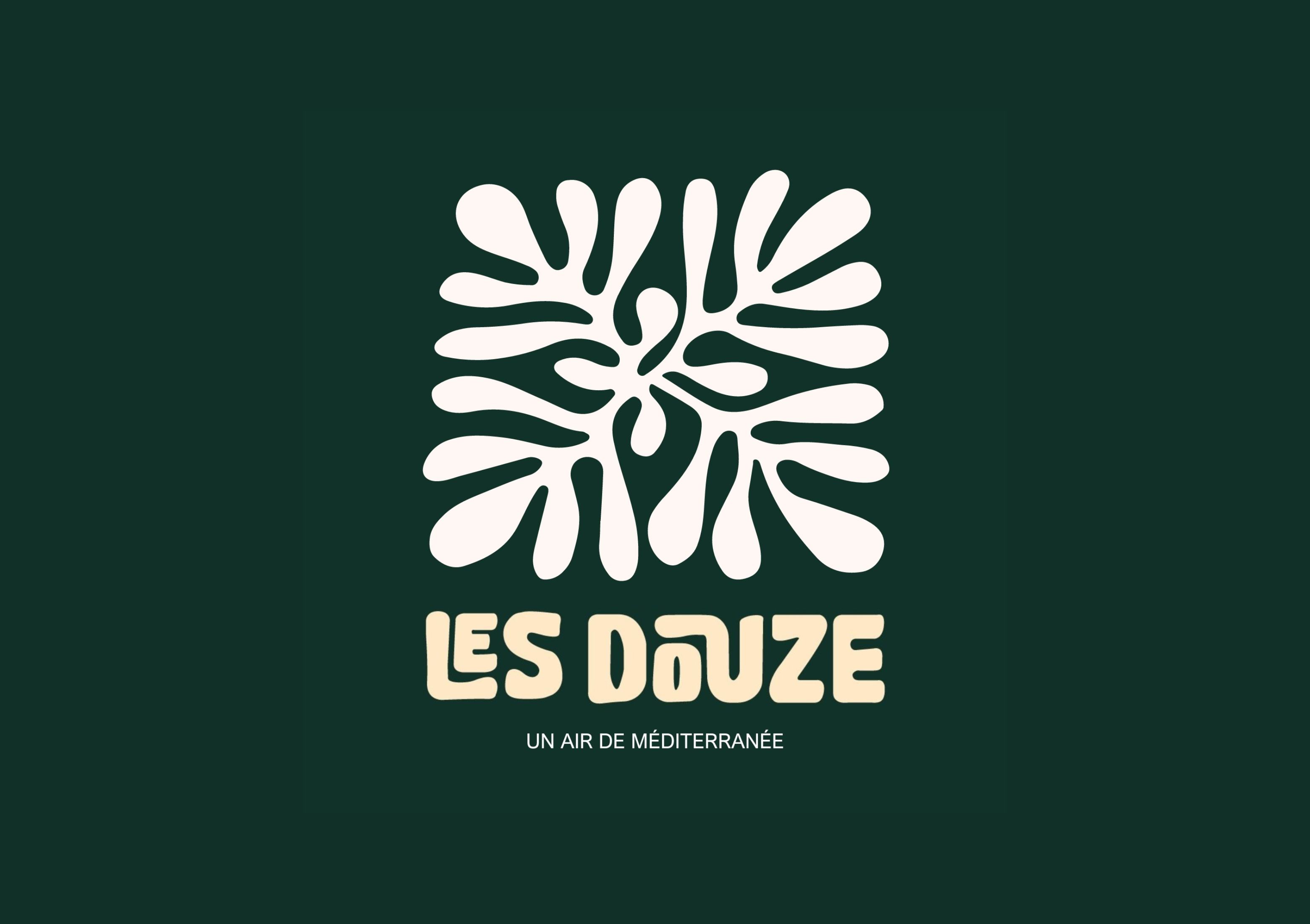
To give you an idea of my work, I created a charte graphique restaurant restaurant called Les Douze avec Adobe Illustrator. The name refers to Jesus' 12 apostles, evoking the last meal they shared together. This moment symbolizes both a moment of sharing and communion, and a milestone, values that I wanted to convey in the brand identity.

La typographie de cette charte graphique restaurant
To reinforce this warm, authentic spirit, I chose an organic-looking font, inspired by the organic architecture found in Greece. This choice creates a visual connection with the natural, harmonious shapes, reminiscent of the fluidity of Mediterranean landscapes.
Les éléments d’illustration de cette charte graphique restaurant
Coral,the charter's central element, echoes the Mediterranean Sea, a key element in the culture of the countries bordering this region. It also refers to the traditional mosaics, rich in color and pattern, found in these same cultures, recalling a common artistic heritage.
La palette de cette charte graphique restaurant
For the colors, I opted for a soft, soothing palette. White and beige bring a sense of purity, light and simplicity, evoking the whitewashed houses of the Mediterranean islands. Dark green and olive green refer to the lush green landscapes and olive trees that are ubiquitous in this region, symbolizing nature, freshness and local resources.
L’ambiance de cette charte graphique restaurant
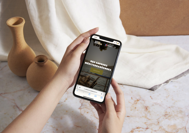
Dans l’ensemble, cette charte graphique restaurant crée une atmosphère conviviale, élégante et profondément ancrée dans les traditions méditerranéennes. Elle reflète un esprit de partage et d’authenticité, tout en restant contemporaine et accueillante. Explorez mon modèle de restaurant Les Douze to discover how your ideas can be brought to life, online and in a unique visual environment.